| |
MARKETING BEAUTY
 The Design Division, Marketing & Display
Inculcating customer loyalty was the job of the Shiseido design division (ishōbu) established in 1916, in charge of both product design and advertising design. From 1917 the design began to reflect a professionalization of production and a more distinctive company look. The volume of advertising continued to increase throughout this period, growing markedly from 1934, when the division was renamed the “advertising design division” (kōkoku ishōbu) and a trained specialist in advertising copywriting was hired. Despite several name changes over the years to the more wartime nomenclature of “advertising dissemination division” (senden fūkyūbu) in 1941 to the slightly more neutral “advertising culture division” (senden bunkabu) after the war in 1952, and then finally to the simplified “advertising division” (sendenbu) in 1957, which has remained until the present, it has been customary within the company to refer to it throughout by the original name of “the design division” because there has been a consistent emphasis on design.12
Ironically, despite Fukuhara’s enormous contribution to the development of advertising design in Japan, he did not like the word “advertising” (kōkoku), a sentiment actually shared by many of his contemporaries around the world who thought of ad men as snake oil salesmen, or even worse, as “hidden persuaders,” as Vance Packard later labeled them in 1957, who used devious subliminal tactics. Fukuhara argued that his ultimate goal was to enhance the company image and not to advertise commodities; consequently he felt that by illuminating the inherently attractive features of a product it would elevate the image of the company. While Fukuhara was clearly ahead of his time in understanding the associative dynamics of brand construction, his earnest statements overlook the fact that these attractive features were not just based on the product’s inherent quality and functionality but they also accrued through packaging, display, and print promotion, which was in effect advertising. In spite of Fukuhara’s ardent claims that “the product speaks for itself,” it is clear from the company’s investment in design and advertising that it did not.
The company in-house image-makers who worked closely with Fukuhara such as Yabe Sue, Maeda Mitsugu, and Yamana Ayao now rank among the best-known Japanese commercial designers of the 20th century. The original division staff included several graduates of the prestigious Tokyo School of Fine Arts (Tokyo Bijutsu Gakkō) and their work reflects a deep knowledge of world art history as well as contemporary fine arts practices. The division also grew to include copywriters and marketing specialists. On several occasions Shiseido raided the advertising divisions of other major corporations; for instance, it hired away Fukuhara’s friend Matsumoto Noboru from advertising innovator Mitsukoshi Department Store in 1917. The two had met in New York where Matsumoto worked for the Simpson, Crawford & Simpson Department Store while attending night school in commercial science (also called economic science) at New York University. Matsumoto was a veteran businessman and added a level of professionalism to the division. The division substantially expanded its personnel and activities the next year in 1918.
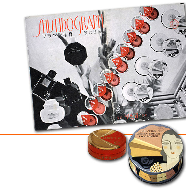
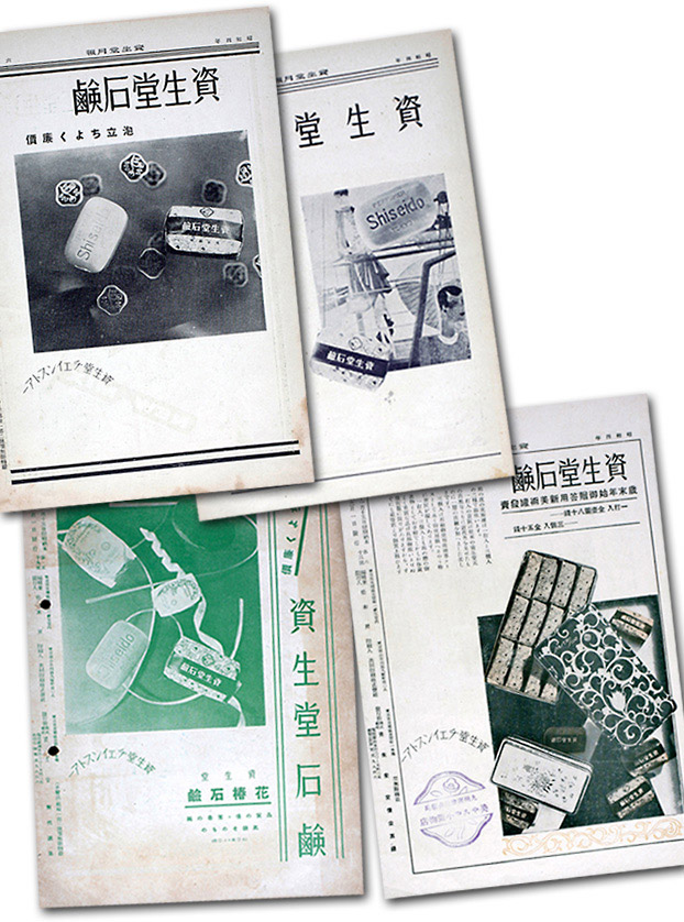
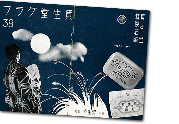
Following the lead of health and beauty industry pioneers abroad like Proctor & Gamble and Lever Brothers, Shiseido inaugurated new marketing initiatives that included the establishment of Shiseido Parlour in the fashionable Ginza district in Tokyo, a stylish retail store with a soda fountain serving ice cream and a beauty salon. Purveying an aesthetic of cosmopolitan elegance and luxury, Shiseido also quickly expanded its reach through the development of a chain store network of retail affiliates throughout the nation and the expanding Japanese empire. Fukuhara stressed the fact that the chain store network standardized goods and prices so a consumer could buy the exact same product anywhere and pay the exact same price for it. Other Japanese companies such as Morinaga Confectionary Company (Morinaga Seika) were similarly developing chain store networks. Morinaga’s was known as the Morinaga Beltline. And like Morinaga, Shiseido cemented its chain store network’s shared corporate identity and values through the circulation of engaging public relations publications such as Shiseido Monthly (Shiseido Geppō) launched in 1924 (later renamed Shiseido Graph [1933 to 1937] and then Hanatsubaki), which was a free giveaway geared toward customers, and Chainstore (later renamed The Chainstore Research [1935 to 1939], The Chainstore [1938 to 1939], and then Shiseido Chainstore Alma Mater [1939 to 1941]), which was an in-house organ that communicated practical product and promotional information to chain store affiliates.
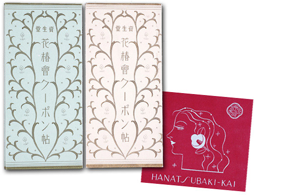
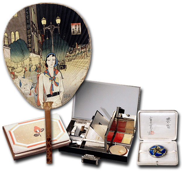
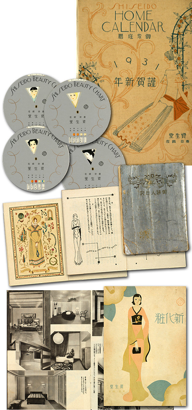
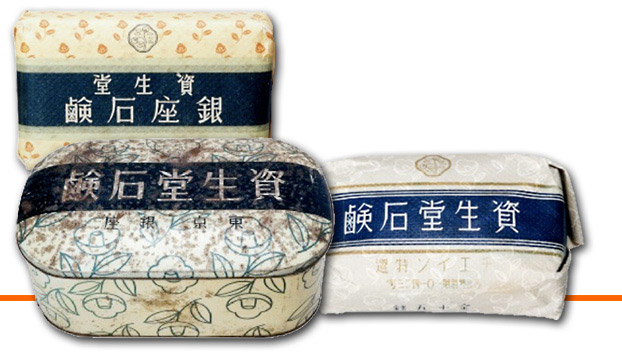
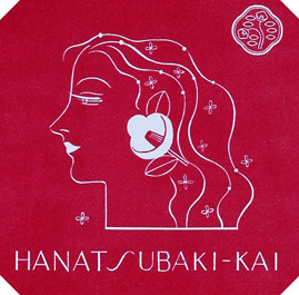
The company similarly engendered customer loyalty through: consumer clubs (for example, the Hanatsubaki-kai or The Camellia Club, established in 1937) and member coupon books; 13 giveaways of highly sought after seasonal promotional items like hand fans, compacts/vanity cases, wallets, and decorative kimono obi sash clasps designed by well-known artists like mingei-affiliated ceramicist Tomimoto Kenkichi; handsomely designed specialty publications like calendars, beauty charts, personal diaries, and detailed beauty manuals and application diagrams; direct marketing forms like brand logo imprinted postcards and match box labels.
|
|
Customer Loyalty Programs
 |
| |
Promotional Events and the “Miss Shiseidos”
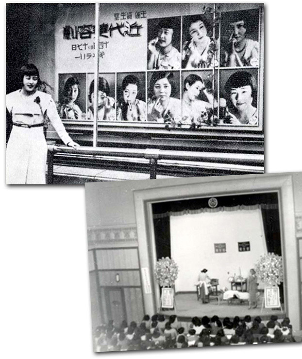
Hands-on educational initiatives were implemented through the attractive and stylish female sales associates known as “Miss Shiseidos,” who toured the country for seven months in 1934 giving beauty advice and demonstrations (advertised as kindai biyōgeki or beauty fashion shows).
|
|
| |
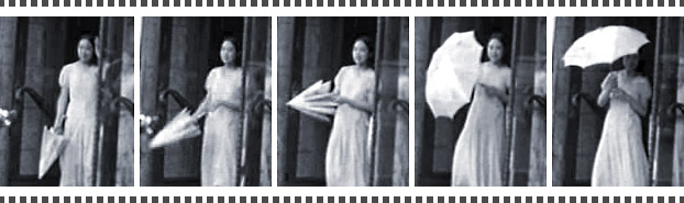
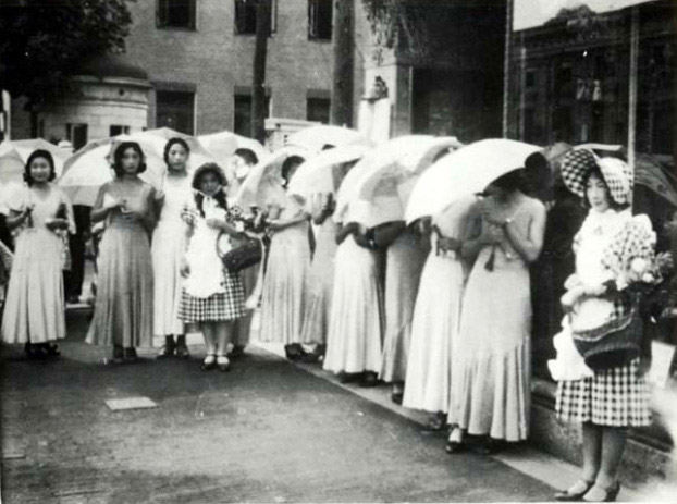
A 1930s film clip from Shiseido’s archives captures a Shiseido promotional event that took place in the Ginza where a group of “parasol girls” (often called “mannequin girls” at the time), clad in fashionable flowing chiffon dresses with trendy Marcel wave hairstyles, carried parasols emblazoned with the Shiseido brand-name and the product name “Shiseido soap.”
|
|
 |
| |
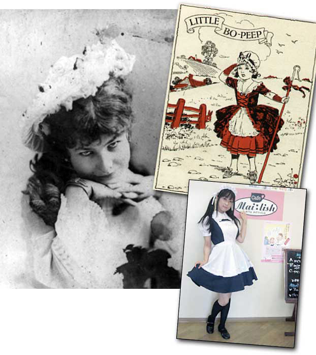
The parasol girls were led by a young woman intriguingly costumed like the Victorian-era nursery rhyme shepherdess Little Bo Peep. In her checkered bonnet and dress, replete with white apron, Little Bo Peep carries a basket of flowers and promotional materials, perhaps products samples, while leading the stylish public parade of Shiseido ladies through the bustling streets of Ginza to the Shiseido store, garnering curious stares by passersby along the way. The women’s outfits stand in striking contrast to the still predominantly kimono-clad women in the streets around them. While unmistakably representatives of the new public social category of the “working woman” (shokugyō fujin), the parasol girls and the Miss Shiseidos could also be identified with the divergent personas of the militant modern girl (modan gāru or moga) or the educated middle-class housewife who embodied the “good wife wise mother” (ryōsai kenbo) ideology. The group enters the Shiseido store and then reappears in front to pose.
|
|
 |
| |
While ostensibly child-like and innocent in character, perhaps even maternal in her apron-clad uniform of fanciful domesticity, the Bo Peep shepherdess is also potentially sexualized as she is easily conflated with the perennially sexy image of the French maid (and in light of the current Japanese fad for “Maid Cafés” with waitresses dressed in precisely this kind of attire, the association does not seem so far-fetched). Bo Peep, along with the liberated feminine icons represented by the Shiseido ladies, is clearly exotic and enticing as well as beautiful.
|
|
| |
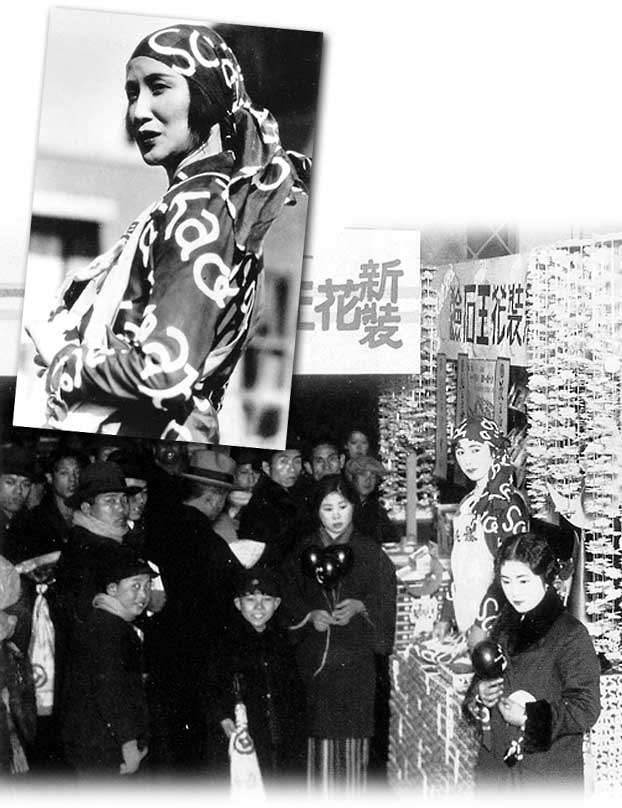
Performative promotional events with logo-costumed salespeople were not uncommon during this period. One prominent contemporary example is rival Kao’s “New and Improved Kao Soap Day” promotional events at Matsuzakaya Department Store which featured the popular actress Hosokawa Chikako dressed up with sales staff in special Kao logo garments.
|
|
| |
In addition to regular seasonal holiday promotional events, including Western holidays like Christmas and Mother’s Day, many Japanese companies invented special promotional days that featured attractive giveaways. Shiseido regularly sponsored “Shiseido day.”
|
|
| |
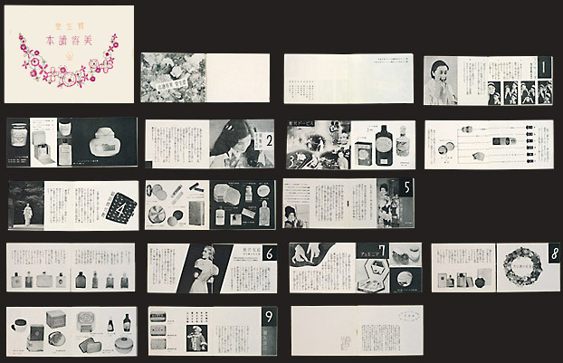
The sustained production and distribution of promotional goods that functioned as both educational, “how-to” information, and as eye-catching advertising, was the critical marketing backdrop that supported these publicity strategies. This included detailed instructional beauty manuals (biyō yomihon) that expounded on a range of topics such as invigorating facial massage, manicures, rapid makeup application for women on the go, makeup for social events and entertaining, Japanese-style makeup, perfumes, and bathing practices.
|
|
| |
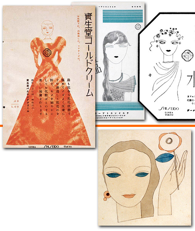
Shiseido beauty manual (Biyō Yomihon), May 1937
Given out to members of the Hanatsubaki-kai, explains: face massage, speed cosmetics (for women on the go), makeup for social visits, “Japanese-style” makeup, social entertaining, makeup, manicures, perfumes, and bathing.
[sh06_1930_ShiseidoBeautyManual]
|
|
|
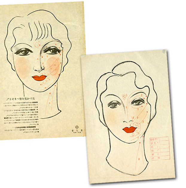
Shiseido also distributed evocative single-sheet images of women’s faces with detailed instructions for the “three dimensional” application of cosmetics, including diagrammatic arrows that imply a systematization of beauty practices purportedly akin to other scientific processes.
 |
| |
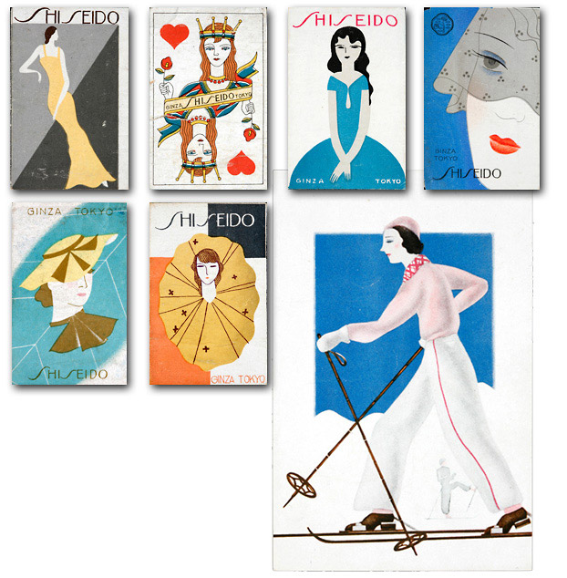
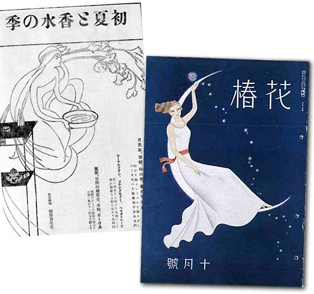
All of these promotional materials were carefully designed and art nouveau was the bedrock of Shiseido’s aesthetic program. Its wild and uninhibited use of lines, highly decorative style, poetic lyricism, and strong sense of individualism were carried through all spheres of the company’s advertising.
|
|
|
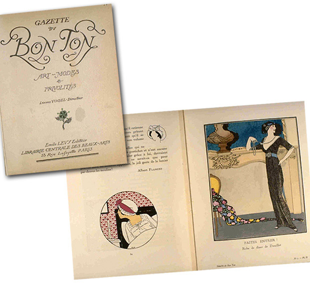
Through his friend Kawashima Riichirō, based in Paris, Fukuhara was able to receive regular installments of the French haute-couture fashion journal Gazette du Bon Ton: Art-Modes et Frivolités (published from 1912 to 1925), which focused on art nouveau/art deco aesthetics and featured designs by well-known illustrator Georges Barbier among others.
 |
| |
Kawashima also sent copies of Femina, Coiffé, and Vogue, which provided rare and valuable design ideas for Shiseido when such publications were not readily available to other Japanese companies through book importers like Maruzen.
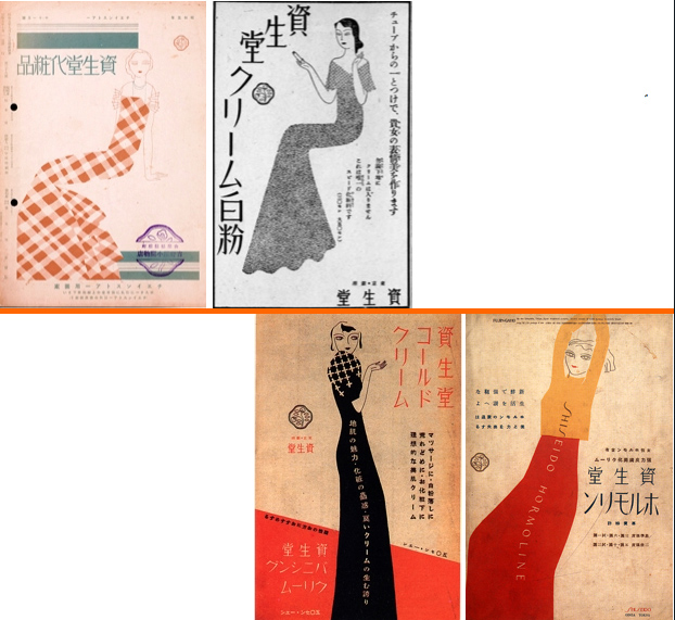
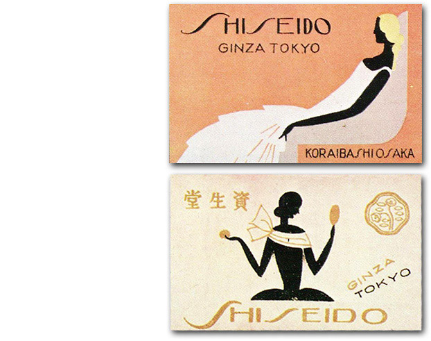
The camellia was chosen as the company logo around 1915, replacing Shiseido’s earlier hawk emblem, because the flower was associated with one of the company’s most popular products, Hanatsubaki camellia scented hair oil. Fukuhara felt that the camellia logo expressed the freshness and newness of the company’s products and the Taishō period in general. It was also clearly much more feminine. Where the hawk, rendered in a detailed engraving style more akin to Meiji trademark images, implied strength and vigilance (in quality), the camellia conveyed an aromatic, gentle femininity. Yabe Sue was in charge of revising the camellia logo based on Fukuhara’s original design. He simplified the shape of the leaves, reduced the number of leaves to seven, and gave the overall formal design an organicism and lyricism in the curvy outer contour lines of the logo. Gradually, all of Shiseido’s products were registered under this trademark and it became the company’s signature logo.
Beautiful, winding arabesque patterns enveloping images of fashionable women and stylized decorative applications of the signature camellia and the camellia logo were just some of the distinctive motifs that pervade Shiseido’s promotional visual vocabulary in print advertising, posters, packaging, and the built environment, contributing to the construction of its unique corporate identity.
|
|
 |
| |
The Female Form
Shiseido designers also experimented with the plastic malleability of the female form, abstracting and attenuating the figures featured in their advertisements to give them a sinuous and sensuous quality that is decidedly non-naturalistic. Long attenuated fingers, hands, arms, and legs make the body lithe and willowy; it also does not accord with any realistic body image, least of all the Japanese one.
|
|
| |
Through the course of the 1920s, this highly mannerist style developed from the more naturalistic organicism of art nouveau to the decidedly more abstract and graphically stylized forms of art deco, although the line between these two styles is not clearly drawn and they coexisted throughout the prewar period.
|
|
| |
In particular, Yamana Ayao’s stylized depictions of beautiful women for Shiseido are full of lightness and grace. His virtuosic pen and ink drawings highlight the expressiveness of line, the evocative abbreviation of form, and put a strong emphasis on the billowing gowns and sinuous curves of the body.
|
|
| |
Yamana minimally describes the facial features of his female figures and he intentionally accentuates their large haunting eyes to draw in the viewer. His individual graphic style became closely associated with Shiseido all the way through to the early postwar period.
|
|
 |
| |
Photography & the New Bauhaus Style
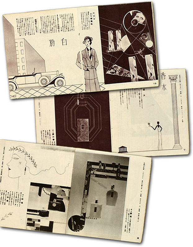
By the 1930s, Shiseido editorial design was clearly influenced by new typographical and photographic layout techniques being developed in Europe at design schools like the Bauhaus in Germany. The marked increase in the use of photography and the appearance of photomontage are clear indicators of this.
In Shiseido’s small-size beauty manual and product catalogue Yosooi (Makeup), which was circulated through the chain stores in 1932, designers Maeda and Yamana collaborated with innovative commercial photographer Ibuka Akira to produce an engaging composition of line drawings and photomontages featuring different categories of Shiseido products. In Yosooi, photographs of modish young women are dynamically interspersed with cosmetic products, luxury items (such as champagne), and associative text fragments in English reading “smart woman,” “chic,” and “modern” to produce a nonlinear promotional narrative linking beauty practices and lifestyle.
|
|
 |
| | 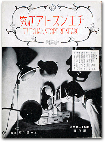
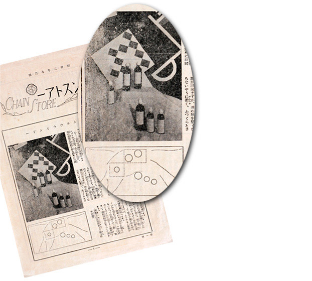
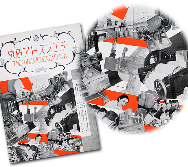
Ibuka Akira also wrote for the photography journal Photo Times as well as in Shiseido’s The Chainstore Research on new techniques in commercial photography, and he was an early champion of the use of photomontage for commercial purposes.
The Chainstore Research 8, Feb. 1936
[sh02_CS_1936_02_1] |
|
| |
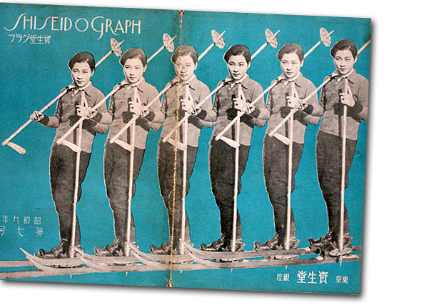
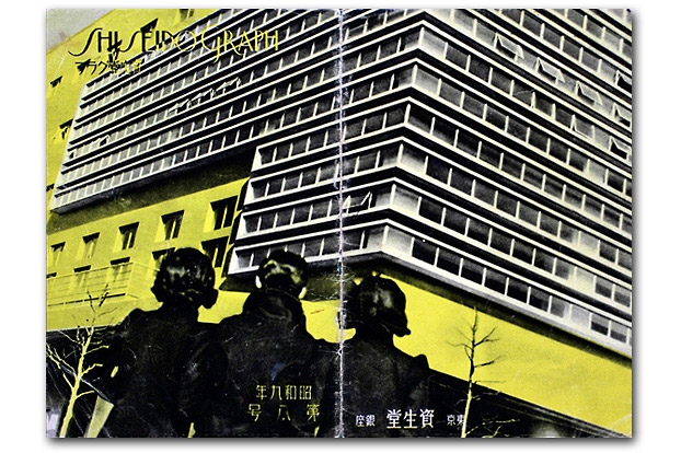
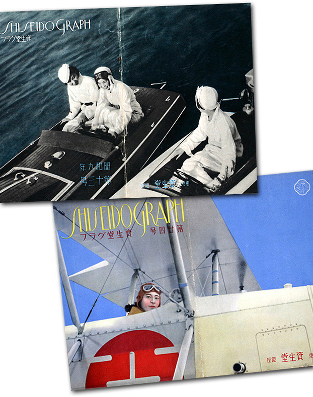
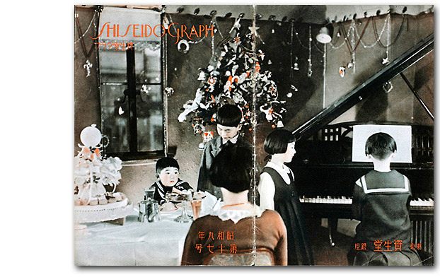
Shiseido Graph
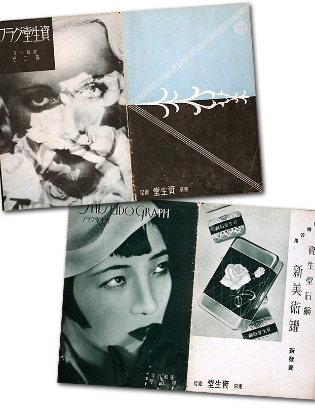
When Shiseido Geppō became Shiseido Graph in 1933, the magazine shifted to a photographic pictorial format. The cover designs feature contemporary Japanese women engaged in a variety of modern upscale leisure activities: skiing, hiking, swimming, bicycling, driving, boating, camping, fishing, playing tennis, golfing, and even flying airplanes.
|
|
 |
 |
| |
Although Shiseido’s consumer base included many working women, they are not the subject of these images, which instead conjure up visions of independent wealth—certainly an aspiration with which all could identify if not experience directly. Only a few covers show women within the home, and these are also highly idealized images of modern middle-class domesticity. In the 1934 December issue, a Japanese family (four children and just their mother) is shown in their living room at Christmas-time with a decorated tree in the background, a lavish meal on the table, and one daughter playing the piano. Positioned behind the seated mother, the viewer is given the mother’s perspective and is encouraged to identify with her empathically as she imagines herself in this homey scene. 15
|
|
 |
| |
The photographic and montage aesthetic of the magazine evoke a strong cinematic association that is reinforced by the use of female subjects, both Western and Japanese, who look like movie stars. It also corresponds to the magazine content, which regularly featured short commentaries on Hollywood starlets like Janet Gaynor, Sylvia Sydney, and Carol Lombard. 16 On the second issue of the magazine, the mysterious face of a blonde Western film actress (a Marlene Dietrich type) emerges through a diaphanous layer of roses; on the cover of another issue, a dramatic close-up of a stunning Japanese modern girl (perhaps a Miss Shiseido) with bobbed haircut, jaunty hat, and eye-catching makeup underscores a similar smoldering sexuality.
|
|
 |
|
The cinematic eye is highlighted on another cover that features an expressionistic montage of replicated female figures (two Miss Shiseidos discussing “movie makeup” while touring the P.C.L. film sound studios outside Tokyo with actress Chiba Sachiko) in horizontal bands that look like film strips.
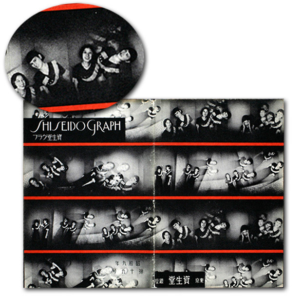 |
| |
A symbol of the precision mass production of the machine age and the reproduced mass culture of modernity, the replicated image is used on several other covers. One features the repeated image of a female skier whose replication evokes images of synchronized chorus line dancers such as the famous Tiller Girls, whose almost mechanistic precision dancing was identified by German theorist Siegfried Kracauer as part of the mass spectacle or “mass ornament” of modernity. Period cartoons of the Tiller Girls even showed them rolling off Henry Ford's mass production line. A later issue of Shiseido Graph includes a photograph of just such a chorus line of indistinguishable bathing suit-clad dancers identified as the Sona Brother’s “1934 Fashion Review.” 17
|
|
| |
Shiseido’s montages extended to replicated images of commodities where the modern face color powder tins, rouges, and cosmetic tubes are conversely substituted for the commodified human form of the Tiller Girl.
|
|
| |
Shiseido Graph also implicitly pointed to the connection between modern women and the modern metropolis by pairing images of women and modernist architecture.
|
|
| |
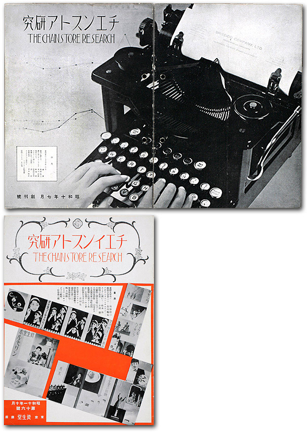
Chainstore Magazine
The in-house Chainstore magazine also radically shifted its editorial design to a photography-based, montage aesthetic around 1935 when it changed its name to The Chainstore Research. The first issue from July 1935 shows a modern typewriter with hands typing on the keyboard and a graph of the company’s profitability in the background. The image extends from the front to the back cover, where we see that the hands are typing on Shiseido LTD letterhead.
|
|
| |
An array of modernist still life photographs of company products are aesthetically laid out in the pages of a number of issues. Some of the most formally innovative uses of photomontage in Shiseido’s advertising are evident in a series of playful, abstract compositions promoting Shiseido soap.
|
|
| |
Paradoxically, even though soap was the company’s best-selling product, Fukuhara saw it as a commodity of the past with fewer possibilities for development. This was in sharp contrast to some of Shiseido’s domestic competitors like Kao who foregrounded soap as their signature product and championed it as a modern staple commodity for a hygienic future.
|
|
| |
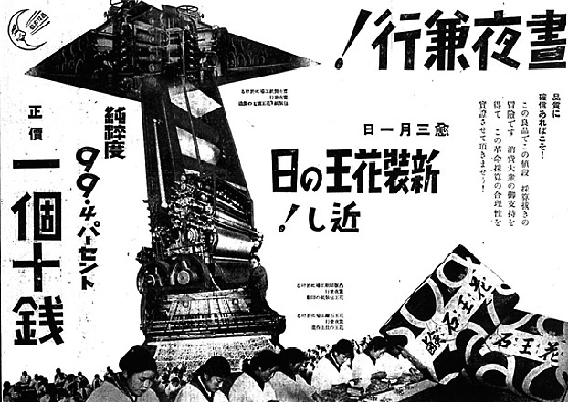
Still, Shiseido’s soap promotion displays a parallel innovative sensibility to Kao, and certain compositional and thematic similarities show an awareness of Kao’s pioneering print advertising. For example, the cover of the March 1936 issue of The Chainstore Research features a striking montage of the company’s industrial technology and female factory workers producing Shiseido soap with abstract reddish-orange shapes and arrows highlighting the dynamic, fragmented composition. 18 |
|
 |
| |
A comparable black-and-white montage image promoting Kao soap appeared in the Yomiuri Shinbun several years earlier in February 1931 in advance of the launch of “New and Improved Kao.” It read, “double-time production day and night!” is preparing for “the approaching day of New and Improved Kao’s arrival.” Rows of apron-clad female workers with their heads bowed intently on work expand across the page in a seemingly endless assembly line. Shooting vertically out of the mass of women is a surging arrow that encompasses the machinery of mass production, appearing as if it is actually producing the women as well. The arrow simultaneously reads as a visual emphasis of the product’s elevated purity asserted to the left. As company workers (but also as women and mothers), by association the Kao female employees attest to the product’s quality. 19
|
|
 |
| |
As briefly touched on earlier, typography was also a burgeoning area of modern design and corporate advertisers took a great interest in the expressive possibilities of letterforms. 20
|
|
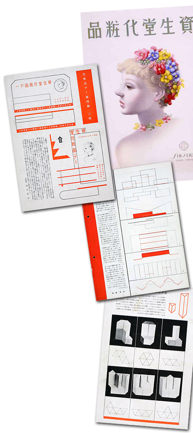
The company’s various magazines offer a plethora of practical information on the application of display lettering. The Chainstore Research (August 1937), for example, provides a list of different numerical typographies to enable chain store retailers to produce “beautiful price cards” for products. 21
The Chainstore Research 26, August 1937
[sh02_CS_1937_08_2]
The November 1937 issue highlights the use of different expressive letterforms for promotional sales signage: the sample signs read, “Shiseido cosmetic products for your gift-giving needs,” (ozōtō-yō); “Large customer appreciation sale”; “Sale commemorating our tenth anniversary”; “Buy your O-seibō gifts here”; and so forth. 22
The Chainstore Research 29,
November 1937
[sh02_CS_1937_11_2]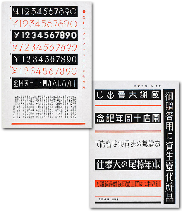 |
| |
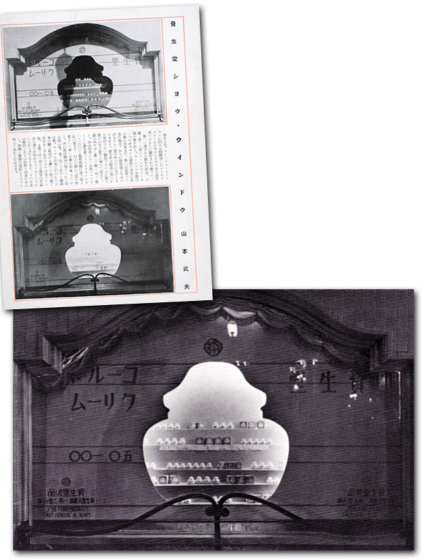
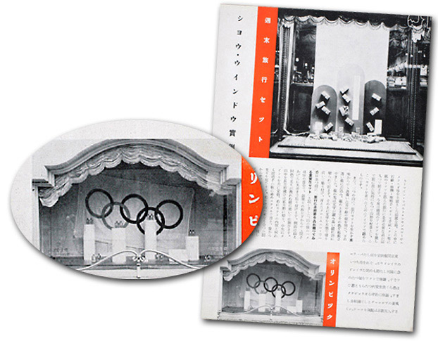
Show Windows
Fukuhara stressed that good products displayed in a good environment would speak for themselves. But regular designs produced for display in show windows (chinretsu mado) and within the chain store retail environment again demonstrate the significant interventions Shiseido made to enhance the visual appeal of their commodities.
|
|
| |
These displays were treated like theatrical stages upon which the company’s products would perform. Fukuhara Shinzo had a special stage set built exclusively to exhibit just his perfume products. He was also very particular about limiting the number of products shown at one time so that they exuded a sense of capaciousness. This required that associates constantly rotate different products into the window.
Displays changed regularly, in fact weekly, and were often keyed to seasonal themes. For example, December and January issues would spotlight Christmas and New Year’s themed displays. One year designers keyed the themes to the chapters of The Tale of Genji. In August 1922, Fukuhara even sponsored an instructional event on set and lighting design run by theater professionals Hijikata Yoshi and Imamura Kazuo. This was run in the evening to maximize the visual demonstrations of lighting effects. 23
We can get a good sense of how chain store retailers combined promotional posters and product displays through the many featured sample arrangements that ran in Chainstore.
|
|
 |
| |
The magazines included detailed illustrations of the various display stand sets and associated props, which was a common subject in period advertising trade journals and design compendia such as the multi-author 24-volume set Gendai Shōgyō Bijutsu Zenshū (The Complete Commercial Artist). 24
|
|
| |
The Retail Environment
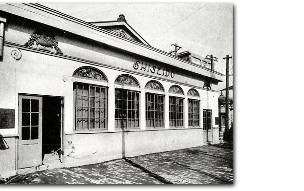
The retail environment was critical for Shiseido as the company took on the role of retailer as well as manufacturer, which naturally directed its attention and energies to developing points of purchase and the storefront, such as its elegant cosmetics division store opened in 1916.
|
|
 |
| |
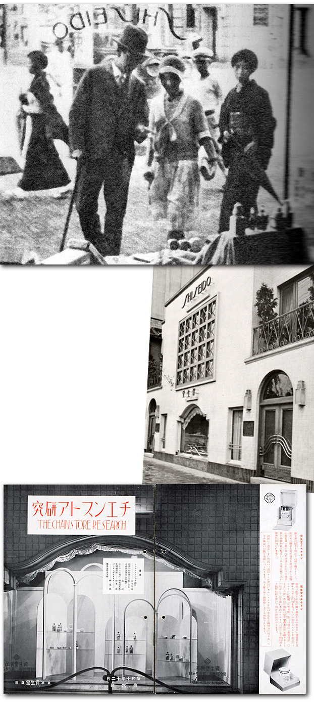
Already in 1902 the company had opened a fountain that sold sodas and ice cream on the American drugstore model. It was the first in Japan. This establishment combined a pharmacy with cosmetics as well as the fountain. It soon became a “famous site” (meisho) in the Ginza cityscape. It was also known as a popular destination for Shinbashi geisha who frequented the fountain and contributed to the place’s attraction for onlookers. Other customers included upper-class women, politicians, civic officials, and prominent businessmen and their families. The fountain was later renamed Shiseido Parlour.
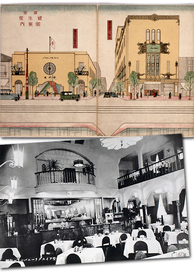
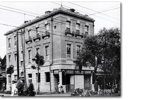
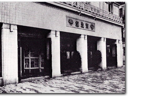
In the early 1920s, Fukuhara Shinzo commissioned architect Maeda Kenjirō, a graduate of the architecture section of the Tokyo School of Fine Arts and a school friend of his younger brother, to redesign the Shiseido building facade. Maeda had apprenticed with American architect Frank Lloyd Wright, who was in the midst of building the now renowned Imperial Hotel in Tokyo.
Maeda squared the Shiseido building’s round pillars and covered them along with the rest of the lower façade in white tile. The second floor above was painted, providing a striking visual contrast in texture and color. This renovation manifestly transformed the building from a Meiji edifice to a trendy Taisho establishment. 25 Shiseido invested heavily in stylish architectural design for all of its stores and the interiors provided an equally elegant experience.
|
|
 |
|
|
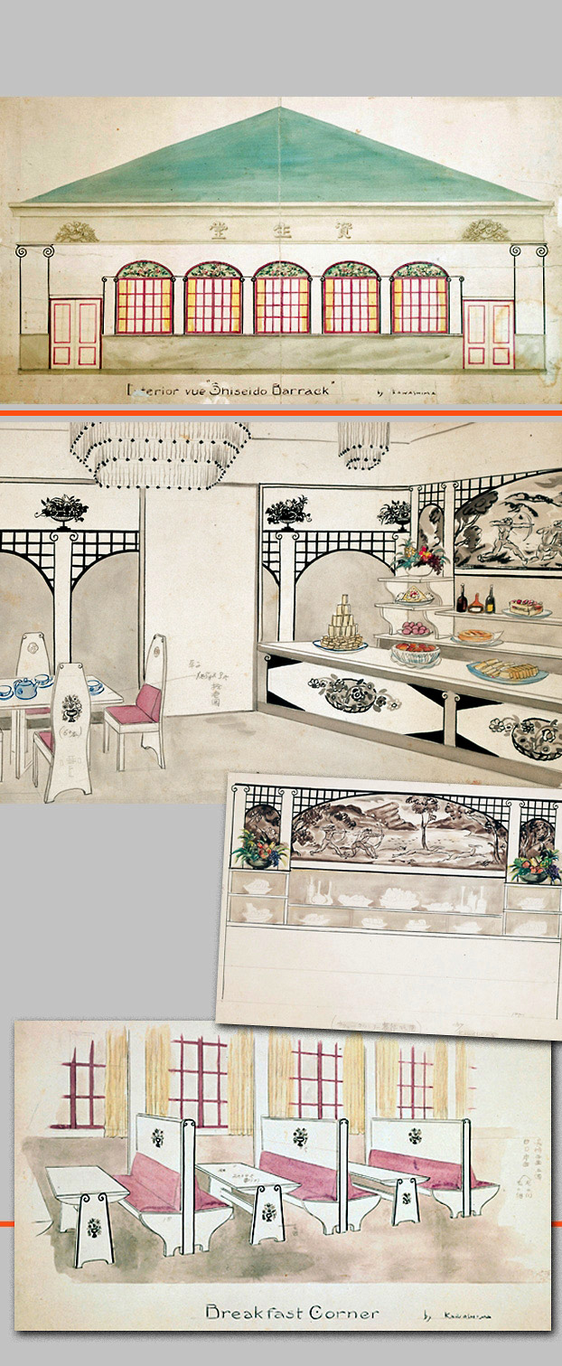
“Shiseido Barrack”
Kawashima Riichirō’s designs convey the stylish temporary quarters of Shiseido’s Barrack Café following the 1923 earthquake.
 |
| |
Maeda Kenjirō was also commissioned by Fukuhara to design Shiseido’s elegant new post-earthquake art deco parlour (left) and retail building (right), the opening of which was heralded with a colorful illustration in Shiseido’s Ginza Guide.
|
|
| |
As Shiseido continued to expand its retail venues, new stores were publicized to both consumers and employees in Shiseido Geppō, including illustrations of the storefront, layout and display design.
|
|
|