| |
Ye Qianyu
“Supply Exceeds Demand, Demand Exceeds Supply”
November 1935 [ms23_021] |
|
| |
WINDOWS ON AN ERA
A Motley Democracy of Forms
As editor of Modern Sketch, Lu Shaofei gave his magazine one mission: “grasp the era.” The guidelines were simple. He invited contributors to send in material that “critiques the fine points of life’s problems, be they large or small” and “describes every level of society.” Submissions were not to “promote any ideological line,” and photographs could be sent in as well, if they were “cartoon-like.”[1] He specifically encouraged contributors to “explore the future, be it bright or dark,” all with the goal of “making life better.”[2] Lu knew very well that his editorial strategy extended an artistic carte blanche to potential contributors. In effect he was asking them, in the spirit of free and uninhibited expression, whoever and wherever they were, to present their personal angles on a complex and anxious era. The visions they offered could, in the interests of exposing a truth, be embellished and exaggerated, and they should have a point—the sharper the better.
But before surveying this imagery, it bears mention that Modern Sketch published both graphic art and the written word. Manwen—the verbal counterpart to manhua—comprised up to one-third of any given issue’s content. In practice manwen referred to a miscellany of jokes, one-act plays, journalistic fragments, erotic anecdotes, travel sketches, glossaries of transliterated “modern” terms, whimsical essays, satirical songs, and drolly cynical social commentary. |
|
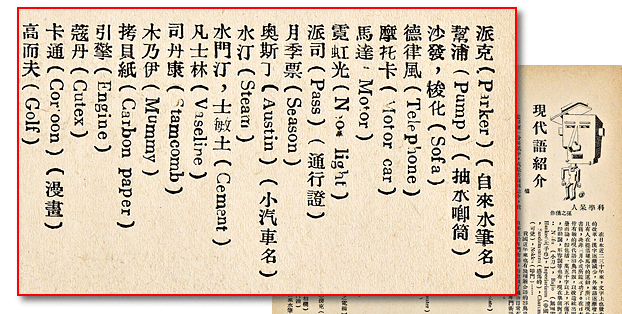 |
  Detail from the Modern Sketch manwen called “An Introduction to Some Modernisms.” Detail from the Modern Sketch manwen called “An Introduction to Some Modernisms.”
Readers found this guide to transliterated loan words so useful they asked for another installment.
(detail highlighted in red)
February 1934 [ms02_028]
|
 |
| |
Although we will not deal with manwen here, it is worth noting that a good deal of written content in Modern Sketch aimed at promoting and developing the art of cartooning. To this end Lu Shaofei not only wrote a column answering practical questions sent in by would-be contributors, but also hosted a substantial series of translated and original articles on the history, artistic techniques, and foreign masters of cartoon illustration.
Foreign Models: Toba Sōjō to James Thurber
China’s cartoonists were keenly interested in where their art came from and how it was developing internationally. The illustrated articles in Modern Sketch, many translated from Japanese, satisfied their curiosity. Here are just a few samples of foreign cartoonists’ art as introduced through Modern Sketch:
|
|
| |
Image by 12th-century Japanese monk Toba Sōjō
April 1935 [ms16_038] detail
|
|
| |
Images by French caricaturist Honoré Daumier (1808-1879)
November 1934 [ms11_039] detail
|
|
|
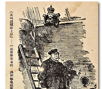
  Image by British graphic humorist Image by British graphic humorist
and long-term Punch contributor
Sir John Tenniel (1820-1914)
February 1935 [ms14_039] detail
|
 Image by German dada- Image by German dada-
expressionist painter
and
caricaturist
George
Grosz
(1893-1959)
December 1934 [ms12_038] |
 |
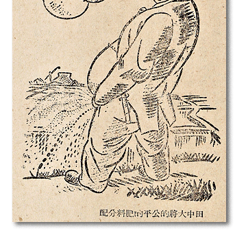
|
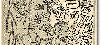
  Image by Japanese leftist cartoonist Masamu Yanase (1900-1945) depicting the expansionist, anti-communist Prime Minister Tanaka Giichi’s “Equitable Distribution of Fertilizer.” Image by Japanese leftist cartoonist Masamu Yanase (1900-1945) depicting the expansionist, anti-communist Prime Minister Tanaka Giichi’s “Equitable Distribution of Fertilizer.”
October 1936 [ms31_041] detail
|
| |
The Mexican artist Miguel Covarrubias (1904-1957), a caricaturist for New York Vanity Fair who visited Shanghai in 1934, had a direct influence on several Chinese cartoonists’ style. For instance, Covarrubias’s clean, linear drawing style seems mirrored in the work of Zhang Guangyu, as can be seen when comparing certain images by the Mexican and Chinese artists. To conclude that Zhang’s style is derivative of Covarrubias’s, however, ignores how both artists participated in the Modernist predilection for primitive art: Mayan in the case of the Mexican artist, Chinese—and beyond—in the case of Zhang Guangyu.[3] Nor should one assume any stigma was attached to copying foreign models. China’s cartoonists saw imitation as a way of building a foundation for an individual style.[4]
|
|
| |
The modernist predilection for primitive art can be seen in an image by a Mexican artist (above, left), and mirrored by a Chinese artist in Modern Sketch (above, right). |
|
  Miguel Covarriubias
“Female Zapatista Soldiers”
February 1934 [ms02_003] detail |
 Zhang Guangyu Zhang Guangyu
detail from “Folk Love Songs” series
February 1935 [ms14_035] detail |
  James Thurber (1894-1961) and other cartoonists of The New Yorker were admired, too, as was that magazine’s smart literary prose, which Modern Sketch’s university-educated, left-leaning theorist Wang Dunqing described as “able to convince average petty urbanites that they are the most clever of intellectuals.”[5] James Thurber (1894-1961) and other cartoonists of The New Yorker were admired, too, as was that magazine’s smart literary prose, which Modern Sketch’s university-educated, left-leaning theorist Wang Dunqing described as “able to convince average petty urbanites that they are the most clever of intellectuals.”[5]
|
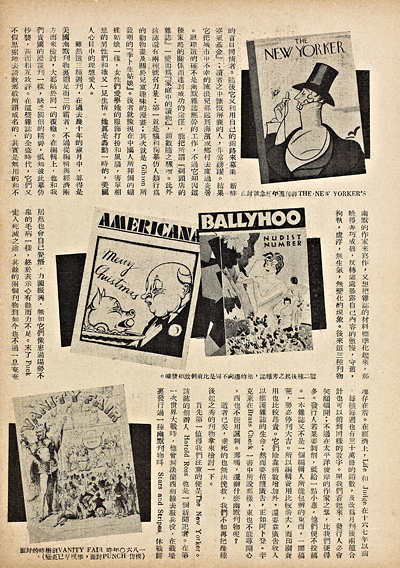 |
Modern Sketch contributors
were avid collectors of foreign magazines, which flowed
into China’s treaty ports
along with the resident and
visiting foreign populations.
August 1935 [ms20_037] |
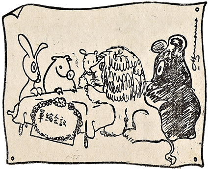 |
  Hua Junwu’s series “New Aesop’s Fables” borrows from The New Yorker cartoonist James Thurber’s beast fables cartoons, but with an explicit political edge, as in this fanciful depiction of an “Arms Reduction Conference.” Hua Junwu’s series “New Aesop’s Fables” borrows from The New Yorker cartoonist James Thurber’s beast fables cartoons, but with an explicit political edge, as in this fanciful depiction of an “Arms Reduction Conference.”
Lion: When you have claws like mine, then well talk about peace.
March 1937 [ms36_009] detail
|
| |
The Geography of an Era
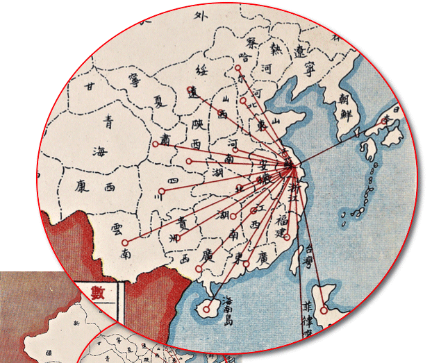
While the Republican-era publishing industry that spawned Modern Sketch was indisputably centered in Shanghai, Lu Shaofei’s vision of capturing the era extended far beyond that city, and far beyond the borders of China proper. A map diagram with accompanying charts, published in February 1937, three years after Modern Sketch began, suggests just how far that network stretched. The smaller, horizontal table provides the number of contributors by career, listing these from the left as Laborer, Merchant, Student, Scholar, Military, and Other. The larger, vertical table enumerates contributors by province and region. |
|
 |
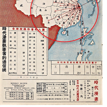 |
 Not surprisingly, provinces like Jiangsu, Hebei, and Guangdong—all locations of major cities—comprise the highest number of contributors. But remote inland provinces such as Yunnan, Gansu, and Guizhou are represented as well, along with Japan, the Philippines, and the “South Seas,” a term referring to Singapore and the Malay archipelago where many ethnic Chinese immigrated or sojourned.[6] Not surprisingly, provinces like Jiangsu, Hebei, and Guangdong—all locations of major cities—comprise the highest number of contributors. But remote inland provinces such as Yunnan, Gansu, and Guizhou are represented as well, along with Japan, the Philippines, and the “South Seas,” a term referring to Singapore and the Malay archipelago where many ethnic Chinese immigrated or sojourned.[6]
|

“The Modern Sketch
Correspondence Network”
(detail highlighted in red)
February 1937 [ms35_045] |
| |
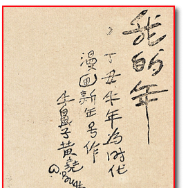
Contributors to Modern Sketch, especially the younger ones, were grateful for the chance to publish. For instance, Huang Yao’s cartoons first appeared in Modern Sketch in 1935, when he was 18 years old.
|
|
  In this drawing, Huang’s signature character W. Buffoon delivers a “blind-fire anti-aircraft salute” in honor of Modern Sketch’s third anniversary. The paintings, calligraphy, and calligraphic paintings Huang created in his later years after settling in Kuala Lumpur were only discovered some years after he died. Many of these have been acquired by the British Museum, the National Palace Museum in Taipei, and the Singapore Art Museum.[7] In this drawing, Huang’s signature character W. Buffoon delivers a “blind-fire anti-aircraft salute” in honor of Modern Sketch’s third anniversary. The paintings, calligraphy, and calligraphic paintings Huang created in his later years after settling in Kuala Lumpur were only discovered some years after he died. Many of these have been acquired by the British Museum, the National Palace Museum in Taipei, and the Singapore Art Museum.[7]
|
 |
| |
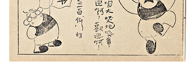 |
The roly-poly W. Buffoon,
created by the young cartoonist
Huang Yao, celebrated Modern
Sketch’s third anniversary
with a flatulent salute.
(detail highlighted in red)
December 1936 [ms33_018] |
| |
Clearly, Modern Sketch had a broad geographic ambition, quite unlike its predecessor Shanghai Sketch, which focused mainly on its namesake city. Material published in Modern Sketch reflected life and times all over Asia, from the arid northern grasslands to the jungles of Malaya. A frequent contributor from China’s northwest, Shen Yiqian, often depicted that region’s Central Asian nomadic peoples. In the mid-1930s, China’s northern provinces were slipping into Japanese hands, a chilling geopolitical reality that gave Shen’s lyrical sketches, like the black-and-white “Travel Manhua,” a political edge.
|
|
| |
Shen Yiqian
“Travel Manhua: Sketches of the Lifeways of
Chahar, Suiyuan, and Mongolia”
February 1937 [ms35_033]
|
|
|
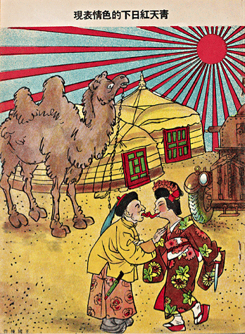
  The same Japanese incursions lent other political cartoons a powerful urgency. For example, Wang Guodong’s “Pornographic Behavior under the Blue Sky and Red Sun” maligns the idea of Inner Mongolians collaborating with Japanese infiltrators, who were at the time maneuvering to set up an “autonomous” North China. The same Japanese incursions lent other political cartoons a powerful urgency. For example, Wang Guodong’s “Pornographic Behavior under the Blue Sky and Red Sun” maligns the idea of Inner Mongolians collaborating with Japanese infiltrators, who were at the time maneuvering to set up an “autonomous” North China. |
 Wang Guodong Wang Guodong
“Pornographic Behavior
under the Blue Sky
and Red Sun”
February 1936 [ms26_024]
|
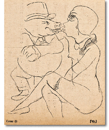 |
  Chinese cartoonists’ domestic concerns were often inflected with international influence, as we can see when comparing Wang’s two figures with those from the George Grosz cartoon “The Kiss,” which was reproduced in the very same February 1936 issue of Modern Sketch. Chinese cartoonists’ domestic concerns were often inflected with international influence, as we can see when comparing Wang’s two figures with those from the George Grosz cartoon “The Kiss,” which was reproduced in the very same February 1936 issue of Modern Sketch.
|
 George Grosz George Grosz
“The Kiss”
February 1936 [ms26_040] |
| |
Meanwhile, thousands of miles to the south, more contributions came from near the equator, in Singapore. One of the most colorful is Zheng Guanghan’s illustration of an ethnic Chinese man who has immigrated to the Malaysian archipelago to homestead in the tropical wilderness.
|
|
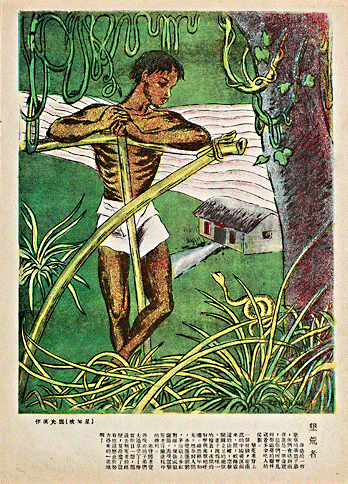 |
   Zheng explains in his lengthy caption that the red rectangles on the front of the hut are Chinese couplets—traditionally pasted in red-paper around doorways during the Lunar New Year festival. He adds that the festival decorations resemble “national flags” symbolizing victory over the jungle wilderness, then warns that these hardy pioneers should not be forgotten by their offspring, especially those who have come north to squander their patrimony in China’s foreign concessions. Zheng explains in his lengthy caption that the red rectangles on the front of the hut are Chinese couplets—traditionally pasted in red-paper around doorways during the Lunar New Year festival. He adds that the festival decorations resemble “national flags” symbolizing victory over the jungle wilderness, then warns that these hardy pioneers should not be forgotten by their offspring, especially those who have come north to squander their patrimony in China’s foreign concessions.
|
 Zheng Guanghan Zheng Guanghan
“Pioneer Farmer”
July 1934 [ms07_023] |
| |
Even more than the geographic variety represented in Modern Sketch, the most striking consequence of Lu Shaofei’s editorial policy was the sheer variety of visual forms he accommodated under the umbrella term manhua, an expression whose meaning extended well beyond what we would normally call cartoons. To be sure, familiar genres—like single-panel “gag” and political cartoons, as well as multi-panel sequential comic strips—made up the backbone of Modern Sketch’s pictorial content. But as we shall see, over time Lu Shaofei accepted and published paper-cuts (jianzhi), collage (jiantie), photographs (sheying), photomontage, and even photos of small sculpted models (mandiao) set in dioramas. Adding to the mix were items like celebrity and political caricature, children’s art, and the magazine’s cover art, the last constituting something of a subgenre in itself. Sketch art was also common, and like Shen’s “Travel Manhua” usually more a form of documentary than humor or satire. Nor did the border between word and image hold firm; newspaper clippings, stock certificates, theater tickets, paper money, and other printed matter were frequently combined with drawings and photographs. Finally, the art submitted did not necessarily have to be fully “modern” in appearance, but could update traditional forms like woodblock illustration.
|
|
 |
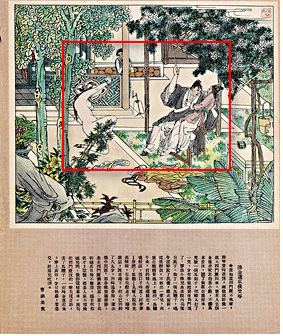 |
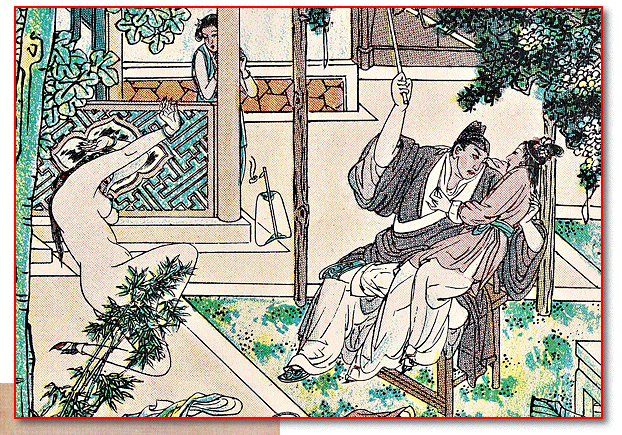
  Each issue of Modern Sketch featured a neo-traditional illustration accompanying an excerpt from the Ming dynasty erotic novel Plum in the Golden Vase (Jin ping mei). The artist, Cao Hanmei, republished the series in two volumes in Each issue of Modern Sketch featured a neo-traditional illustration accompanying an excerpt from the Ming dynasty erotic novel Plum in the Golden Vase (Jin ping mei). The artist, Cao Hanmei, republished the series in two volumes in
1936 and 1937.
(detail highlighted in red)
June 1935 [ms18_022]
|
| |
Cover Art
Designed to define Modern Sketch in the eyes of readers, the magazine’s full-color front covers offer a convenient point of entry into its diverse subjects and styles. What strikes the viewer’s eye now, as it surely did in the 1930s, is a consistent theme of eroticism. Nude or semi-nude figures were undoubtedly displayed to titillate the potential buyer. Yet during the first decades of the Republican period nudity could also project positive symbolic values, such as freedom, liberation, and physical health—all tropes aimed at counteracting representations of China as the tradition-bound, feeble, “Sick Man of Asia.”
|
|
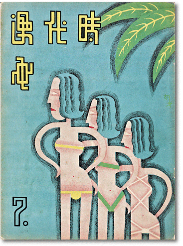
  Thus on the one hand we can be sure that Hu Kao’s geometrically minimalist bikinis, featured on the July cover and entitled “Swimsuits of 1934,” poke fun at Shanghai fashion trends. But on the other hand, we need to take Lu Shaofei at least partially at his word when, in his explanation of Hu Kao’s cover at the back of the same issue, he explains, “The body is not a crime; misfortune can only arise from insufficient knowledge of it.” Thus on the one hand we can be sure that Hu Kao’s geometrically minimalist bikinis, featured on the July cover and entitled “Swimsuits of 1934,” poke fun at Shanghai fashion trends. But on the other hand, we need to take Lu Shaofei at least partially at his word when, in his explanation of Hu Kao’s cover at the back of the same issue, he explains, “The body is not a crime; misfortune can only arise from insufficient knowledge of it.” |
|
 Hu Kao Hu Kao
“Swimsuits of 1934”
Cover of the July issue.
July 1934 [ms07_000]
|
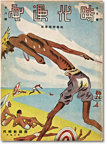
  When flat modernist compositions like Hu Kao’s give way to a deeper visual perspective, semi-nude images lent themselves to socially motivated figure-ground compositions. On the cover of the July 1936 issue Lu Shaofei depicted an emaciated boat-tracker foregrounded against a tableau of idle beachgoers. Beyond the stark contrast of rich and poor, contemporary readers would have quickly detected a subtler irony in this composition: the tracker and the bathers are almost equally well tanned. When flat modernist compositions like Hu Kao’s give way to a deeper visual perspective, semi-nude images lent themselves to socially motivated figure-ground compositions. On the cover of the July 1936 issue Lu Shaofei depicted an emaciated boat-tracker foregrounded against a tableau of idle beachgoers. Beyond the stark contrast of rich and poor, contemporary readers would have quickly detected a subtler irony in this composition: the tracker and the bathers are almost equally well tanned. |
 |
 Lu Shaofei Lu Shaofei
“Opening Up a New Era”
Cover of the July 1936 issue.
July 1936 [ms28_000]
|
| |
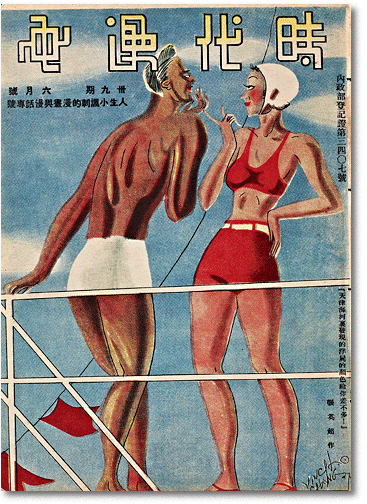
Skin color in such a context was, so to speak, no joke, as further suggested by the cover of Modern Sketch’s final, June 1937 issue, drawn by Zhang Yingchao, an artist generally deemed politically superficial because his style followed that of the American flapper-fashion illustrator, Russell Patterson (1893-1977).
|
|
  Here, however, the mildly salacious surface appearance of two swimmers—one a svelte, pale-skinned, bikini-clad woman and the other a muscular, darkly tanned man—is sharply undercut by the fine print of the caption: “You’re almost the same color as the corpses found floating in Tianjin’s Hai River.” Here, however, the mildly salacious surface appearance of two swimmers—one a svelte, pale-skinned, bikini-clad woman and the other a muscular, darkly tanned man—is sharply undercut by the fine print of the caption: “You’re almost the same color as the corpses found floating in Tianjin’s Hai River.” |
 |
 Zhang Yingchao Zhang Yingchao
[Caption:] You’re almost the
same color as the corpses found
floating in Tianjin’s Hai River.
June 1937 [ms39_000]
|
| |
Readers of the time would have immediately recognized this caption as referring to the hair-raising mystery of hundreds of male corpses, mostly those of able-bodied men between the ages of 20 and 40, recently found drifting down Tianjin’s Hai River below the Japanese Concession. The local Chinese authorities insisted that the bodies were those of heroin addicts from drug houses in the city’s foreign concessions. Strong circumstantial evidence, however, indicated that the Japanese army had been using the river to dump bodies—those of Chinese laborers originally hired to build military installations, and then brutally silenced to maintain secrecy.[8]
|
|
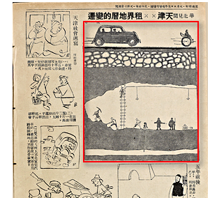 |
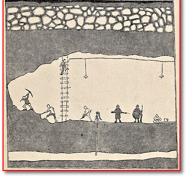
  Especially during the latter half of its three-year run, Modern Sketch became a platform for airing otherwise censored information. For instance, due to fear of exacerbating tensions with the Japanese, the Nationalist regime blocked major newspapers from speculating on Tianjin’s floating corpse incident. But because it was not regarded as a “serious” publication, Modern Sketch could get away with publishing cartoons like Gu Yi’s “News from North China: Changes to the Stratum under the XX Concession,” which appeared in April 1937. Especially during the latter half of its three-year run, Modern Sketch became a platform for airing otherwise censored information. For instance, due to fear of exacerbating tensions with the Japanese, the Nationalist regime blocked major newspapers from speculating on Tianjin’s floating corpse incident. But because it was not regarded as a “serious” publication, Modern Sketch could get away with publishing cartoons like Gu Yi’s “News from North China: Changes to the Stratum under the XX Concession,” which appeared in April 1937. |
 Gu Yi Gu Yi
“News from North China:
Changes to the Stratum under
the XX Concession”
The word “Japan” was forbidden
by government censors, thus
the X’s. Readers, however,
would have had no problem
filling in the blanks.
(detail highlighted in red)
April 1937 [ms37_014] |
|
  The political innuendo behind Zhang Yingchao’s swimsuit tête-à-tête shows that there can be more to Modern Sketch’s cover art than first meets the eye. As a general rule, however, cover illustrations eschewed visual subtlety. Political messages were typically quite stark, though often tinged with irony, as in Chen Juanyin’s December 1936 cover “Viewing the Sunrise over the East China Sea.” The political innuendo behind Zhang Yingchao’s swimsuit tête-à-tête shows that there can be more to Modern Sketch’s cover art than first meets the eye. As a general rule, however, cover illustrations eschewed visual subtlety. Political messages were typically quite stark, though often tinged with irony, as in Chen Juanyin’s December 1936 cover “Viewing the Sunrise over the East China Sea.” |
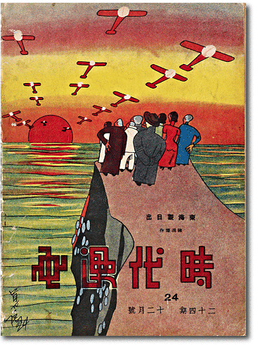 |
 Chen Juanyin Chen Juanyin
“Viewing the Sunrise over
the East China Sea”
December 1935 [ms24_042]
|
  Where Chen quite plainly takes aim at his fellow nationals’ passivity in the face Japanese expansionism, elsewhere political commentary could be conspicuous for its absence. For example, the only politics to be found in “New Temptation in Pink,” by Japan-educated oil painter Chen Baoyi, are those of the sexual encounter, as facilitated by Shanghai’s lively coffee-shop culture. Where Chen quite plainly takes aim at his fellow nationals’ passivity in the face Japanese expansionism, elsewhere political commentary could be conspicuous for its absence. For example, the only politics to be found in “New Temptation in Pink,” by Japan-educated oil painter Chen Baoyi, are those of the sexual encounter, as facilitated by Shanghai’s lively coffee-shop culture. |
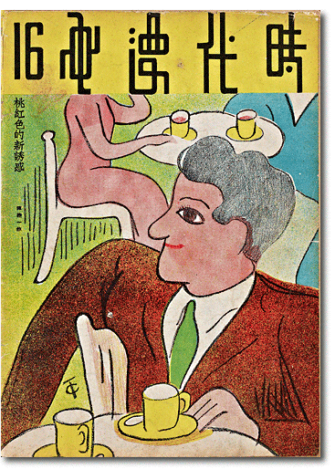 |
 Chen Baoyi Chen Baoyi
“New Temptation in Pink”
April 1935 [ms16_042]
|
  Other covers, like Zhang Guangyu’s cheerful January 1935 contribution, commemorated the Republican government’s Year of Children... Other covers, like Zhang Guangyu’s cheerful January 1935 contribution, commemorated the Republican government’s Year of Children... |
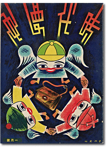 |
 Zhang Guangyu Zhang Guangyu
untitled cover
January 1935 [ms13_000]
|
  ...or were drawn by children themselves, like the Chinese opera character published that same year in March. ...or were drawn by children themselves, like the Chinese opera character published that same year in March. |
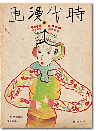 |
 Chen Keyan Chen Keyan
Martial Spirit
March 1935 [ms15_042]
|
  A cover from 1936 featured a statuesque black woman athlete to celebrate the achievements of “colored peoples” in the 1936 Berlin Summer Olympics... A cover from 1936 featured a statuesque black woman athlete to celebrate the achievements of “colored peoples” in the 1936 Berlin Summer Olympics... |
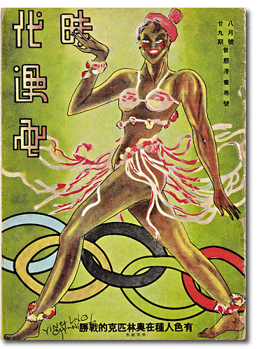 |
 Zhang Yingchao Zhang Yingchao
“The Olympic Victory of
Colored Peoples”
August 1936 [ms29_000]
|
  ...while one from 1935 grotesquely caricatured petty-bourgeois passengers in a second-class rail coach. When it came to cover art, it seems safe to conclude that fans of Modern Sketch quickly learned to expect the unexpected. ...while one from 1935 grotesquely caricatured petty-bourgeois passengers in a second-class rail coach. When it came to cover art, it seems safe to conclude that fans of Modern Sketch quickly learned to expect the unexpected. |
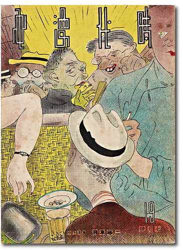
|
 Ye Qianyu Ye Qianyu
“The Second-class
Rail Carriage”
July 1935 [ms19_000]
|
| |
Visual Narrative: The Japanese Menace
During the several years before Modern Sketch began publication, Japan had invaded Manchuria, taken over the neighboring province of Jehol (Rehe), and occupied even the Great Wall of China. By 1936, the Nationalist Government had been pressured into signing treaties that effectively ceded to Japan the northern provinces of Chahar, Hebei, Shandong, Shanxi, and Suiyuan. For Chiang Kai-shek, appeasing Japan meant more resources to attack a domestic foe: the Chinese communists. But China’s elites, cartoonists included, were outraged by this disregard for national integrity. Nor were they pleased with political passivity among their countrymen, or worse, the acts of collaboration—whether willing or coerced at bayonet-point—reported from the occupied northern provinces. The artists of Modern Sketch responded to the impending national crisis with unruly imagination, portraying Japan and the threat it posed with a cascade of unpredictably diverse satirical imagery.
|
|

|
| |
Single-panel Cartoons: Windows on an Era
For all their rich variety, cover illustrations belong to the most plentiful subgenre found in Modern Sketch: the captioned, hand-drawn, single-panel cartoon. Including cover art—but excluding media like paper-cuts, photographs, and photomontage—Modern Sketch published over 1000 single-panel works. To call these “windows onto an era” may sound like a convenient, even reductive, cliché. For several important reasons, however, the comparison is helpful. First, Lu Shaofei’s invitation for contributors to frame and expose the inner workings of their life and times calls to mind the idea of window-like visual openings onto a larger picture of reality. Second, in terms of the visual structure of the magazine itself, Modern Sketch inherited the conventions of the pictorial magazine, whose format encouraged the reader’s eye to travel vicariously, and often voyeuristically, into the new and unknown.
|
|
  Then as now, pictorial publications were not so much read as scanned, a process that involved searching for, then engaging or rejecting, the various demands for sympathy, action, shame, laughter, envy, pleasure, shock, horror, and so on offered by framed images arranged on the plane of the page—not unlike windows arrayed on the face of a building. Then as now, pictorial publications were not so much read as scanned, a process that involved searching for, then engaging or rejecting, the various demands for sympathy, action, shame, laughter, envy, pleasure, shock, horror, and so on offered by framed images arranged on the plane of the page—not unlike windows arrayed on the face of a building. |
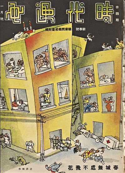 |
 Xu Ruoming Xu Ruoming
“Floating Blossoms Fill
the City in Spring”
January 1937 [ms34_000]
|
| |
Strictly speaking, pictures are not windows; but to disregard the striking iconic resemblances between one and the other would be a mistake. This is because beyond surface appearances, windows by their very nature visually mediate interiors and exteriors, insiders and outsiders, the seers and the seen, the dominator and the dominated, making them an endlessly flexible figure for picturing, and potentially inverting, unequal power relations. It should not come as a surprise, then, that contributors to Modern Sketch played extensively with the visual ironies made available by positioning the frames of windows within the frames of their cartoons. In doing so they open some thought-provoking windows for us—outsiders to the historical world of Modern Sketch—onto how the single-panel cartoon constructed the multi-layered imagery of an era.
|
|
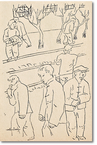
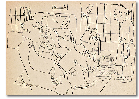
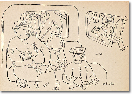
  Cartoon windows could be large or small, transparent or opaque, viewed from within or without. In Lu Zhixiang’s series “Shanghai Winter,” for instance, window glass separates the haves from the have-nots, but also positions the gaze of the viewer on either side of a stark economic divide. Not to be ignored either is that Lu published these images in a January issue; like many popular pictorials, the content of Modern Sketch shifted with the seasons. Cartoon windows could be large or small, transparent or opaque, viewed from within or without. In Lu Zhixiang’s series “Shanghai Winter,” for instance, window glass separates the haves from the have-nots, but also positions the gaze of the viewer on either side of a stark economic divide. Not to be ignored either is that Lu published these images in a January issue; like many popular pictorials, the content of Modern Sketch shifted with the seasons. |
 |
 Lu Zhixiang Lu Zhixiang
“Shanghai Winter” series
They just go on with
their lives like this, no sense
of the changing seasons.
January 1934 [ms01_024] detail
|
 |
  Lu Zhixiang Lu Zhixiang
“Shanghai Winter” series
(The Master at one in the afternoon) You should say Good morning!
January 1934
[ms_01_024]
|
  Lu Zhixiang Lu Zhixiang
“Shanghai Winter” series
(Street scene on a cold day)
“Why don’t these people
have leather overcoats?”
January 1934
[ms_01_025]
| 
|
| |
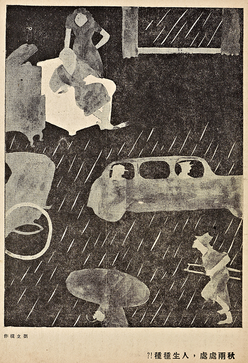
Liu Lipu’s 1934 cartoon “Human Lives in Ubiquitous Autumn Rain” achieves a similar effect—also through the icon of the window, but using soft, rounded, faceless figures in shades of gray rather than Lu Zhixiang’s spare, bleak line drawing. In Liu’s composition stylized raindrops visible through the open window in the panel’s upper right corner offer a visual point of entry from the leisure apartments of a wealthy man and his female companion out into the cold wet street below, where a rickshaw puller exposed to the elements hauls his fare. The puller’s gaze is tilted upward to view a passenger riding comfortably behind the windows of a chauffered limousine—the motorized, upper-class counterpart to his own human-powered vehicle. What does the rickshaw man feel? Longing? Resentment? Resignation? In the absence of facial features we can only guess. But following his gaze beyond the automobile, we return to the warm, dry interior of the wealthy man’s chamber, lending closure to the top and bottom of the panel, and leaving us to ponder the nature of the relationship between these two men.
|
|
 |
| |
Liu Lipu
“Human Lives in Ubiquitous Autumn Rain”
October 1934 [ms10_006] |
|
| |
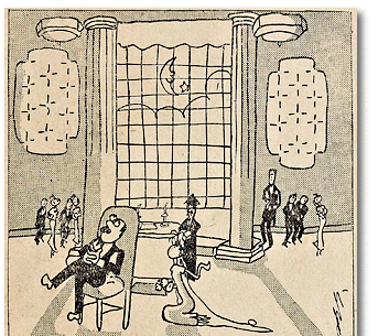
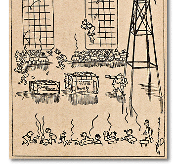
Windows always serve some compositional purpose, sometimes simply to define the plane of an interior wall, to provide “light,” or to indicate night and day. Even without any notable objects or people visible through them, windows can by their sheer size signify power and wealth, setting the scene for the cartoonist’s barbs.
|
|
  Shen Tuzheng, for example, uses a giant picture window as backdrop for a cartoon satirizing nepotism in government officialdom. Shen Tuzheng, for example, uses a giant picture window as backdrop for a cartoon satirizing nepotism in government officialdom. |
 |
  Shen Tuzheng Shen Tuzheng
- But Daddy, you promised! He said
that certificate of appointment would
be in the bag for him tomorrow!
October 1936 [ms31_031] detail
|
 |
  Hua Junwu Hua Junwu
Manager of the Tarzan Mattress Company: Gentlemen, observe the bounciness of our mattresses!
December 1935 [ms24_011] detail |
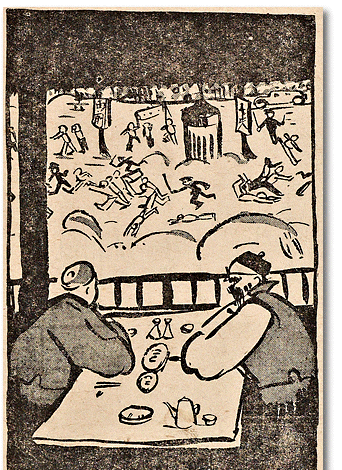
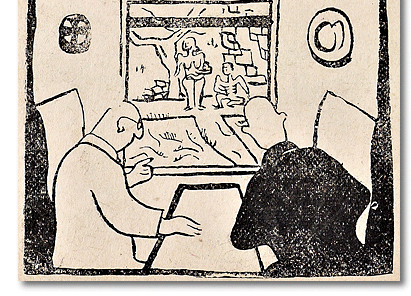
  More commonly windows are drawn as open frames set within the larger frame of a cartoon panel, thus aligning the viewer’s gaze with the detached perspective of the rich, who are often shown making cold commentary on anonymous panoramas of political violence and social misfortune. More commonly windows are drawn as open frames set within the larger frame of a cartoon panel, thus aligning the viewer’s gaze with the detached perspective of the rich, who are often shown making cold commentary on anonymous panoramas of political violence and social misfortune. |
 |
  Chen Fengxiong Chen Fengxiong
(sent from Beijing)
Grandson: Grandpa, look at these kids. Why don’t they stay home and eat their supper instead of letting the police beat them up for petitioning the government? They just don’t get it. Hey, another one’s down. They just don’t get it.
Grandpa: That’s quite enough. You might upset them. Come, let’s drink!
February 1936 [ms26_021] detail
|
 |
  Liu Xinquan Liu Xinquan
(sent from Hong Kong)
“The West Wind
Creeps East”
Tourist: The people of your esteemed country go about naked. Such ill manners!
Tour guide: Again you misunderstand. These are members of a nudist society, a fashion that has come here from your esteemed country.
January 1937 [ms34_014] detail |
| |
Cartoonists also used windows to position the viewer as a sexual voyeur. Interestingly, not all artists who did so were male.
|
|
  One of the very few woman cartoonists who published in Modern Sketch, Liang Baibo, places a pair of highly-stylized female nudes conversing in front of a large window. As was often the case, the caption undermines the image, here with an ironic aside on men’s continuing preference for the outmoded fashion of foot-binding. One of the very few woman cartoonists who published in Modern Sketch, Liang Baibo, places a pair of highly-stylized female nudes conversing in front of a large window. As was often the case, the caption undermines the image, here with an ironic aside on men’s continuing preference for the outmoded fashion of foot-binding. |
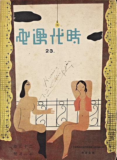
|
 Liang Baibo Liang Baibo
To the woman with
bound feet: You have more
boyfriends than I do!
November 1935 [ms23_000]
|
  The densely built, window-ridden environment of the treaty-port cities certainly encouraged a fascination with the role of the voyeur. The desired object of the gaze, however, might be left to the imagination, as in Ye Qianyu’s August 1934 cover “Ingredients of Seduction”... The densely built, window-ridden environment of the treaty-port cities certainly encouraged a fascination with the role of the voyeur. The desired object of the gaze, however, might be left to the imagination, as in Ye Qianyu’s August 1934 cover “Ingredients of Seduction”... |
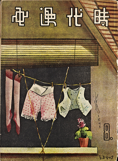
|
 Ye Qianyu Ye Qianyu
“Ingredients of Seduction”
August 1934 [ms08_000]
|
  ...or viewers and the viewed might all be on display through a balcony window nearly coextensive with the cartoon frame itself. ...or viewers and the viewed might all be on display through a balcony window nearly coextensive with the cartoon frame itself. |
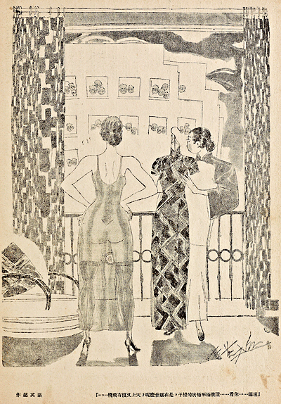 |
Zhang Yingchao
Mama Zhao, what are
those ugly mugs looking
at? It’s not as if an airplane
were flying over...
February 1934 [ms02_013]
|
| |
Not all windows belonged to buildings. Jin Mo’s “Evening on the Pearl River” uses the stern window of a sampan as the focal point for his single-panel window onto the “salt-water sister” (xianshuimei) prostitution trade near the southern treaty port of Canton. Salt-water sisters (note the abbreviation “S.W.” on the pennants) was the term for prostitutes who since the 19th century had exclusively served foreign sailors around the treaty ports of Hong Kong and Canton. From today’s perspective the most striking element of this cartoon is its lack of explicit condemnation for prostitution, imperialism, or worse—Chinese prostitution catering to imperialist powers. Seeing this cartoon, his eyes drawn inexorably to the sordid scene in the window of the sampan, would a typical Chinese male reader of the 1930s feel appalled? Bemused? ...or appalled at his own voyeuristic—and thus vaguely complicitous—bemusement?
|
|
  Precisely because such questions are impossible to answer, this cartoon raises our awareness of the historical gap between the interpretive conventions of today and those of the 1930s, especially when it comes to politics of representing the nation. Without exception, the artists of Modern Sketch were deeply concerned with the fate of China. But when confronted with a cartoon like Jin Mo’s, we are reminded of how much the rules for expressing such concern have changed. Precisely because such questions are impossible to answer, this cartoon raises our awareness of the historical gap between the interpretive conventions of today and those of the 1930s, especially when it comes to politics of representing the nation. Without exception, the artists of Modern Sketch were deeply concerned with the fate of China. But when confronted with a cartoon like Jin Mo’s, we are reminded of how much the rules for expressing such concern have changed. |
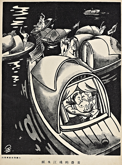
|
 Jin Mo Jin Mo
“Evening on the
Pearl River”
July 1935 [ms19_015]
|
| |
Visual Narrative: A Child Prostitute’s Life
The actual number of prostitutes working in China’s big treaty ports may not have increased from the 1920s into the 1930s, but their public visibility exploded during those years. At the same time, the figure of the prostitute-as-victim entered the popular imagination as a metaphor for the weakness of a semi-colonized, harshly oppressed China. Prostitutes of all varieties and attitudes proliferated in Modern Sketch. Wang Zhu’s nine-panel “Illustrated Biography of a Child Prostitute” takes the victimization story to a shocking extreme, narrating the physical and mental devastation of a “little thing” (the euphemism for underage sex workers) in the treaty port of Tianjin.
|
|
| |
Especially in the later years of Modern Sketch’s 39-issue run, cartoonists used the image of the window to express intensifying distress over imminent national crisis.
|
|
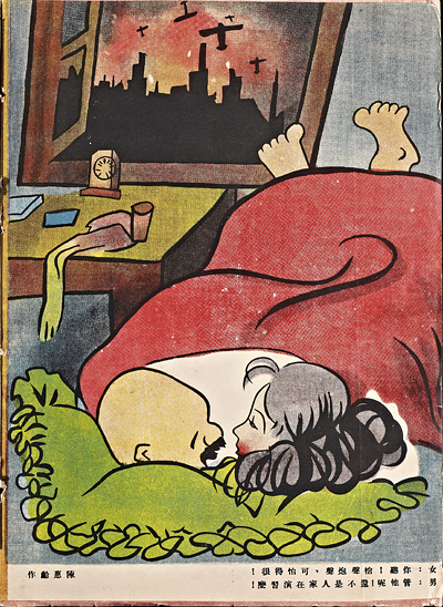
  For instance, cartoonists like Chen Huiling drew attention to Japanese military exercises as a sign of looming invasion. The open window in his illustration from November 1936 forces us to share a view of skyline and aircraft with two lovers. His caption suggests that we be alarmed less at the warplanes than the hedonistic couple’s willful obliviousness to events outside. For instance, cartoonists like Chen Huiling drew attention to Japanese military exercises as a sign of looming invasion. The open window in his illustration from November 1936 forces us to share a view of skyline and aircraft with two lovers. His caption suggests that we be alarmed less at the warplanes than the hedonistic couple’s willful obliviousness to events outside. |
|
 Chen Huiling Chen Huiling
Her: Just listen to the
gunfire! How frightening!
Him: Oh forget about it.
Nothing but another round
of military exercises by
the you-know-who!
November 1936 [ms32_024]
|
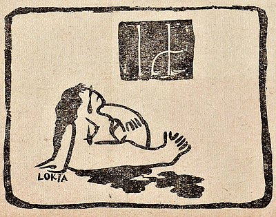
  If large windows symbolize power, small ones could be icons of entrapment and despair, as in an untitled cartoon by Lu Di in Modern Sketch’s final issue. If large windows symbolize power, small ones could be icons of entrapment and despair, as in an untitled cartoon by Lu Di in Modern Sketch’s final issue. |
|
Lu Di
untitled
June 1937
[ms39_025] detail
|
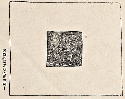
  Or, as shown in one of Liao Bingxiong’s simple, deceptively child-like compositions, the very lack of windows could inspire hope in the face of despair. Or, as shown in one of Liao Bingxiong’s simple, deceptively child-like compositions, the very lack of windows could inspire hope in the face of despair. |
 |
Liao Bingxiong
It’s a bright world outside
the prisoner’s cage!
January 1937
[ms34_036] detail
|
| |
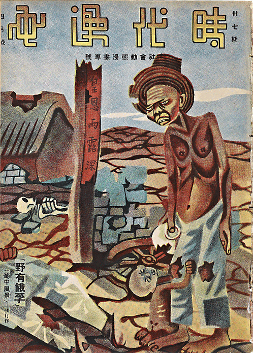
Liao’s was a much-needed optimism. Three months later, in April 1937, a cover by Zhang Ding envisioned the consequences of having a home bereft of windows, doors, and even walls. The caption, based on a quotation from the Confucian philosopher Mencius, indicates that this was a depiction of the rural famine and local warfare ravaging the inland province of Sichuan. For the urban reader of Modern Sketch, the near total exposure of Zhang’s desperate peasant may have held an allegorical meaning. Beyond suggesting privation in the distant countryside, the image of shattered walls, windows, and doors implied a larger and more immediate sense of vulnerability: that faced by the Chinese nation itself, confronted by the overwhelming forces of Japanese militarism then massing on its distressingly porous borders.
|
|
 |
| |
Zhang Ding
“Victims of Famine Lie Dead in the Wilderness
(The Scenery of Central Sichuan)”
The writing on the broken doorframe is half of a traditional New Years couplet, invoking the “deep and fulfilling blessings of the emperor.” Zhang includes it as bitter commentary on the failure of China’s current rulers.
April 1937 [ms37_000] |
|
| |
Economic inequality, official corruption, the rural-urban divide, student protests, the predilections of petty-urbanite readers, the depredations of the Japanese, representations of women...Modern Sketch has something for almost everyone with an interest in modern China. The single-panel cartoons in Modern Sketch and other periodicals of the time can indeed be treated as windows onto specific historical realities. But the frequency and variety with which images of windows themselves appeared in these cartoons should tell us something more: that these cartoonists, by observing the world around them and emulating colleagues either in China or abroad, were developing their own iconic language of the cartoon. Just as what we say depends on how we say it, “reading” even the simplest cartoons requires attention to how the cartoonists of Modern Sketch manipulated the dynamic visual discourse that emerged from the magazine’s every page. Understanding this art also requires moving deeper into the motley graphic forms that were redefining the art of the Chinese cartoon.
|
|
| |
Visual Narrative: Exploitation & Oppression
Many cartoonists felt compelled to expose the suffering and injustice that the strong inflicted on the weak in a society riven by uneven distribution of wealth and power. The issues they represented—construction site accidents, corrupt officials, degradation of women, and the hard lot of the poor in the city and the country—were as alive in the minds of Chinese then as now: all part of the never-ending feast of big fish on little fish that haunts the dark underside of modernity.
|
|
|


